Interior Design Trends Leaving 2026: Interior Design Trends That Are Finally Leaving in 2026
The Short Verdict
Gray walls, open-plan layouts, shiplap, and rattan furniture are not just dated in 2026 — they’re actively dragging down how homes feel and how they sell. This is a breakdown of exactly which trends are leaving, what’s replacing them, and when it actually matters. Because the worst move is spending money on a renovation that’s already peaked.
The All-Gray Palette: A Decade of the Wrong Neutral
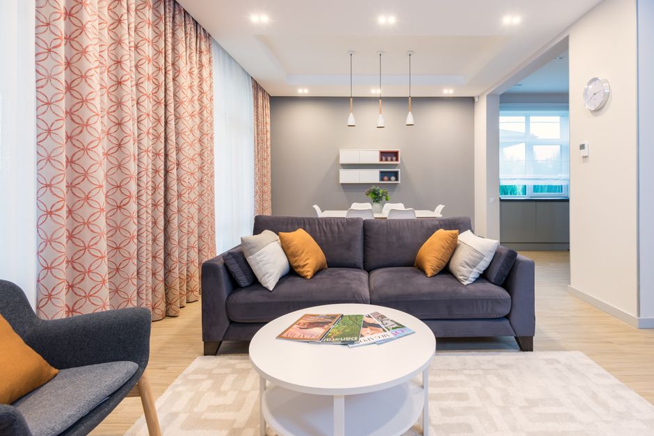
Benjamin Moore Revere Pewter (HC-172) was the most-specified paint color in North America for years running. Farrow & Ball’s Elephant’s Breath (No. 229) did the same job in British and aspirational American interiors. The logic made sense: gray is a non-color, it goes with everything, it signals sophistication without risk.
What actually happened is that every home started looking like a corporate co-working space. Cool gray reads cold under natural light — even colder under LED lighting. When an entire generation of homes uses the same “neutral,” it stops functioning as a neutral and starts functioning as a timestamp.
The pivot is already visible in paint brand color-of-the-year picks. Benjamin Moore’s 2026 selection is Cinnamon Slate, a warm dusty purple-brown. Sherwin-Williams chose Quietude, a muted sage green. Dulux has been consistently pushing toward blush and warm beige. The direction is consistent across all of them: warmth, richness, colors with actual personality.
Gray vs. What’s Replacing It
| The Gray Era Look | What’s Replacing It | Specific Examples |
|---|---|---|
| Cool gray walls, white trim | Warm clay, terracotta, earthy tones | Farrow & Ball “Dead Salmon”, Annie Sloan “Primer Red” |
| Gray laminate flooring | Warm oak or walnut tones | Kährs, Pergo warm-tone ranges |
| Chrome fixtures throughout | Unlacquered brass, aged bronze | Brizo, Waterworks, Rocky Mountain Hardware |
| White 3×6 subway tile | Zellige, limewash, warm stone | Clé Tile, Fireclay Tile |
One practical note: you don’t need to repaint your whole house to shift the feeling. Swapping cool-gray throw pillows, rugs, and smaller accessories for terracotta, rust, and warm linen often moves a room further than you’d expect without touching the walls at all.
Open-Plan Living: The Layout Trend That Hit a Wall
For two decades, open-plan was the unquestioned default aspiration. Knock out the load-bearing walls, merge the kitchen, dining room, and living area into one light-flooded expanse. Estate agents led with it in listings. Renovation shows built it on every episode. Everyone said they wanted it.
The flaw only became undeniable in 2026 and 2026, when millions of households spent 18 months working from home inside these spaces. One person on a video call disrupts everyone else’s concentration. Cooking smells travel instantly across the entire ground floor. There’s no acoustic separation, no visual boundary, nowhere to be alone in your own home without retreating to a bedroom. The trade-off — visual spaciousness — turned out to cost more livability than anyone had accurately priced.
By 2026, architects and interior designers were openly discussing the reversal. The replacement isn’t a return to a warren of small closed rooms — it’s zoned living: creating psychological rooms within larger footprints using changes in ceiling height, half-walls, built-in shelving, area rugs, and flooring transitions. The Japandi aesthetic (Japanese-Scandinavian hybrid) handles this particularly well: calm, defined zones, minimal clutter, a deliberate sense of separation between functions without physical enclosure.
What Zoning Actually Looks Like
A large area rug under the sofa and coffee table defines the sitting zone. A shift from hardwood to tile signals where the kitchen begins. A built-in storage bench separates a dining area visually from the rest of the space. None of these require structural changes — they require thinking about how a space is used, not how it photographs from above.
There’s also a resale consideration here. Open-plan was treated as an automatic selling point in property listings for years. That’s shifting. Buyers looking for work-from-home-capable homes now ask specifically about acoustic separation and dedicated desk space. A thoughtfully zoned floor plan answers both questions. An undifferentiated open expanse cannot. If your open-plan layout genuinely works for your household, leave it. Open-plan isn’t wrong — it just isn’t automatically aspirational anymore.
Farmhouse Style: What the Shiplap Era Left Behind
HGTV’s Fixer Upper ran from 2013 to 2018, but the farmhouse aesthetic it popularized kept spreading for another four years afterward. By 2026, these are the clearest visual signals that a home hasn’t been revisited since 2019:
- Shiplap accent walls — horizontal white wood planks, almost always in the living room. The definitive Joanna Gaines signature now functions as a renovation timestamp.
- Interior sliding barn doors — they don’t seal sound, they don’t lock properly, they swing out and block adjacent wall space. The novelty has been fully spent.
- Open shelving with “curated” kitchenware — styling-intensive to maintain, impractical for daily cooking, and immediately recognizable as a specific moment in Pinterest history.
- Galvanized metal accents — wire baskets, metal buckets, industrial-style pendant lights in a rustic context. The industrial-farmhouse hybrid aged badly.
- Word art — “Gather.” “Home.” “Family.” Nothing more needs to be said about this one.
The replacement isn’t a new aesthetic gimmick. It’s real texture: limewash paint finishes, genuine wood grain (not wood-look vinyl), zellige tile, linen curtains, and rooms that read as if someone thought carefully about them rather than assembling them from a trend checklist.
The Gallery Wall: A Fix for a Problem That Could Have Been Solved Better
The gallery wall was, at its core, a practical solution to a real problem: how do you fill a large wall without committing to one expensive piece of art? IKEA’s RIBBA frames made it achievable at any budget. Pinterest spread the template. For a solid decade, living rooms accumulated fifteen mismatched frames in three different finishes — mixing family photos, motivational quotes, botanical prints, and abstract art into a composition that nobody had designed as a whole.
The honest verdict: most gallery walls look cluttered rather than curated. They grew one frame at a time, and the result reflects that. What replaced them is both simpler and more effective: one piece of art at a scale that actually suits the wall. A single 40×60 inch print from Minted, or something sourced from a local artist via Saatchi Art, has more visual presence than 15 RIBBA frames combined and requires no ongoing curation to maintain.
For those inclined toward empty wall space: that’s now a legitimate design decision, not an absence of ideas. An intentionally bare wall in a warm, well-painted room reads as confidence. RH (Restoration Hardware) and West Elm both quietly shifted their room staging toward single large-format works and deliberate bare walls — it photographs better, and it holds up in person. If your gallery wall contains pieces you genuinely love, keep them. The mistake to avoid is adding more frames simply because empty space makes you uncomfortable.
Fast-Furniture Boho and Rattan: Three Questions That Explain Everything
How did rattan take over every room between 2019 and 2026?
IKEA released the JASSA collection and it sold out repeatedly. West Elm offered sculptural rattan accent chairs at $400. Target had near-identical versions for $60. Basket-weave pendant lights appeared in virtually every rental apartment photography session. The look was photogenic on Instagram, achievable on any budget, and required almost no design knowledge to assemble convincingly.
Why does it look dated now?
Because it peaked at every price point simultaneously. When the same aesthetic exists at $30 and $800 at exactly the same moment — same silhouette, same material, just different construction quality — it loses any sense of distinction within months. The boho look also demanded ongoing styling effort that most households stopped putting in after the initial setup. Wilting dried pampas grass and layered jute rugs require active maintenance to read as intentional. Without it, they just look abandoned.
What’s the actual replacement?
Natural materials remain completely relevant — the shift is toward quality and specificity. Solid oak furniture from Hay or Muuto doesn’t read as a trend. It reads as furniture someone bought because they wanted it specifically. Real linen upholstery, hand-thrown ceramics, stone surfaces. The difference between a deliberate material choice and a fast-furniture trend is that the former doesn’t have a peak-and-trough cycle on Instagram.
What’s Actually Replacing These Trends in 2026
| Trend Leaving | Why It’s Fading | What’s Taking Its Place |
|---|---|---|
| Cool gray paint (Revere Pewter, Elephant’s Breath) | Reads cold, became ubiquitous, aged quickly | Warm clay, terracotta, deep earthy neutrals |
| Open-plan layouts | No acoustic privacy, poor WFH functionality | Zoned living within open footprints |
| Shiplap and sliding barn doors | Oversaturated farmhouse aesthetic | Limewash finishes, real wood texture, zellige tile |
| Gallery walls (15 mismatched RIBBA frames) | Accumulated rather than designed | Single large-format art or intentional blank walls |
| Fast-furniture rattan and boho styling | Peaked simultaneously across all price points | Quality natural materials: oak, linen, stone, wool |
| All-white subway tile kitchens | Generic, cold, instantly datable | Zellige, limewash, warm stone, terracotta |
The thread connecting all of these replacements is the same: rooms are moving away from looks assembled quickly and optimized for a listing photograph, toward spaces that reward actually spending time in them. Warmth, texture, acoustic comfort, real material quality — none of these photograph as dramatically as a perfectly staged open-plan kitchen. That’s precisely why they last longer than the trends they’re replacing.

Recent Comments